A MILLION ADS
Bringing clarity to an interface managing millions of dynamic audio variants
As Product Design Lead at A Million Ads, I was the sole designer working to overhaul the core editing interface used by creative producers to build and sign off dynamic audio ads for some of the world's biggest brands.
CHALLENGE
A Million Ads' proprietary platform, Studio, powers dynamic audio advertising by personalising audio content based on variables like location, weather, time, and date. A single ad can produce hundreds of variants from those combinations. Arrange View was where producers had to manage all of it, and it wasn't built for that level of complexity.
Defining Success
Producers were spending up to three days editing a single dynamic ad. Working with the PM, we set an ambitious target of cutting that to around a day and a half. But the more useful framing was why it was taking so long. Producers weren't slow; the interface was regularly creating situations where they lost context, couldn't verify what they were looking at, or needed to ask for help to complete routine tasks. Our three success criteria reflected that:
Producers completing edits without assistance from the product team
A measurable reduction in moments of lost context or confusion
The most demanding tasks, checking variants and setting rules, feeling faster and more intuitive


Discovery
Before moving into high-fidelity designs, I sketched early concepts to pressure-test my assumptions. The core tension was how to surface controls producers needed constantly without competing with the timeline space, which led me to think carefully about progressive disclosure: what needed to always be visible, and what could be tucked away without breaking context.
From that, five design challenges emerged:
Visualising audio with many variations. Showing all variants at once is noise; hiding them loses traceability. The challenge was making the set comprehensible without flattening what made each variant distinct.
Showing which ad version is playing. Without persistent state indication, producers were regularly unsure whether what they were listening to matched what they were looking at.
Building confidence in rule logic. Rules based on conditions like weather or location are abstract. Producers needed to trust that what they'd configured would produce the right output, which meant making the logic readable, not just editable.
Making rule testing quick and easy. Testing a rule required too many steps. It needed to feel like a quick check, not a task in its own right.
Editing individual audio blocks. Trim and volume adjustments needed to feel precise without pulling focus away from the wider timeline.
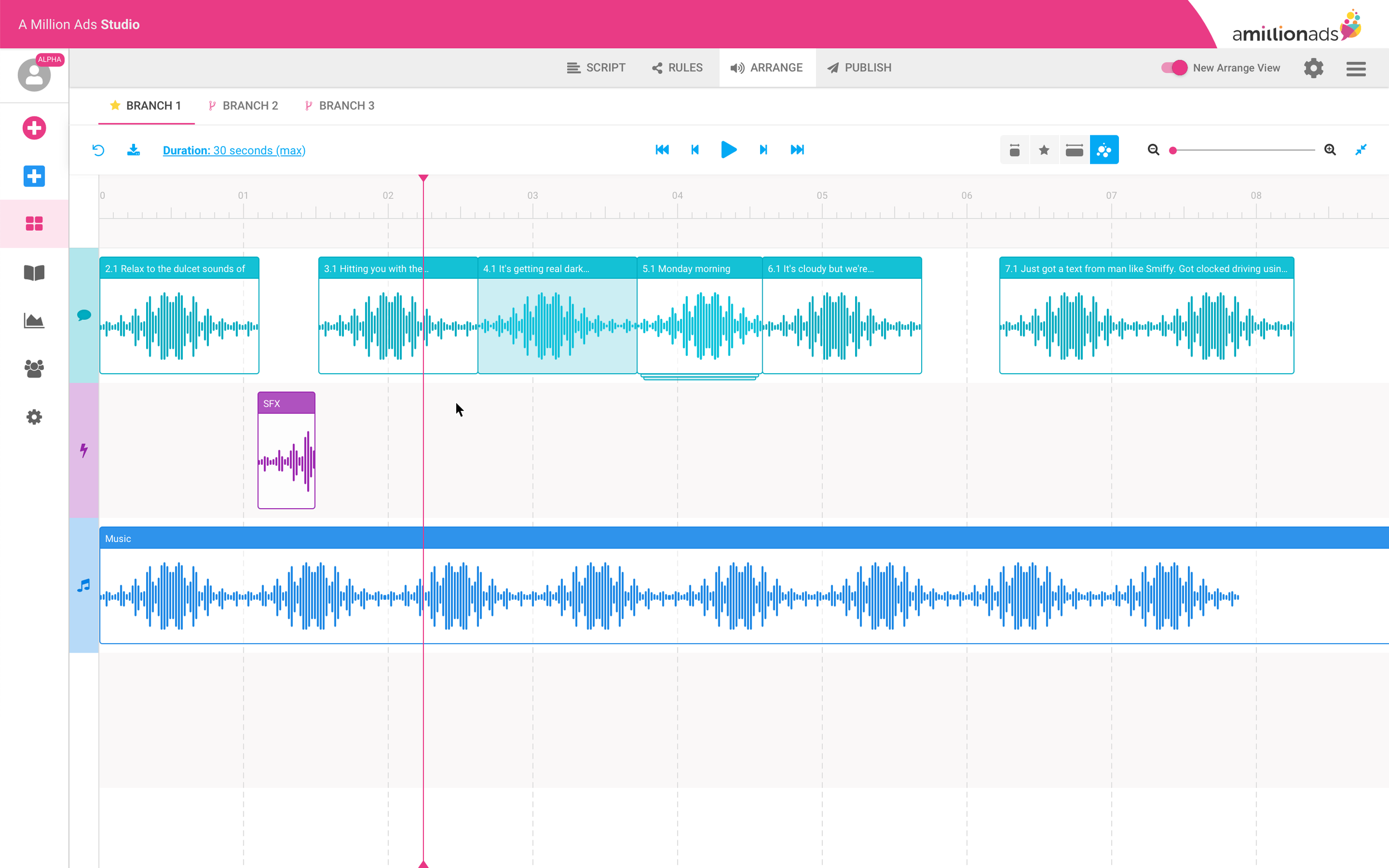
The side-bar problem
My initial instinct was a sidebar panel. It separates contextual controls from the primary workspace, it's familiar to anyone who's used a creative tool, and it scales reasonably well as controls grow. I expected producers to adapt to it.
They didn't. The feedback was unanimous: the sidebar was eating into the horizontal space they needed for the timeline. But what they were really telling me was something more fundamental. In this interface, the timeline isn't just the primary workspace, it's the primary reference point. Every decision a producer makes is oriented around what they can see in it. Reducing that space didn't just feel cramped; it broke the mental model the whole workflow depended on.
I moved the controls to a horizontal bar above the timeline instead. It wasn't my preferred aesthetic call, but it respected the constraint that actually mattered. The reaction was immediately more positive.

I tested the redesigned interface with five internal creative producers, using high-fidelity screen mocks rather than a full clickable prototype. With a tool this complex, a full prototype would have introduced too many edge cases, risking producers getting caught on gaps rather than responding to the design itself.
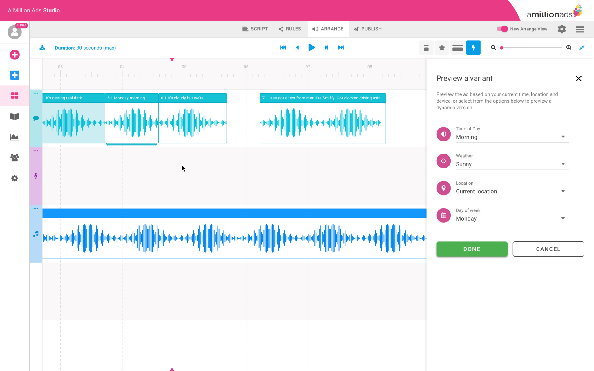
For the variant management section, I used the sessions to resolve open questions rather than validate a finished solution:
Is a dropdown the right interaction for switching variants, or does it obscure too much?
Is drag-and-drop legible for reordering, or does it introduce ambiguity?
Do producers need search or filter at this stage, or does that add unnecessary complexity?
Should the number of visible variants be limited, or should producers see the full set?


Key learnings
Producers treat the timeline as sacred. Any design that competes with it, even a familiar pattern like a sidebar, will be rejected
Internal users are valuable proxies when external users aren't available, particularly when they share the same pain points
Progressive disclosure is essential when the underlying product is inherently complex. Not everything needs to be visible at once
Low-fidelity sketching has limits with highly complex software, but it's still a valuable tool for pressure-testing assumptions before committing to higher fidelity work

Prototype
Below are some selected screens from the prototype I tested with participants. I used high-fidelity screen mocks (not full flows) to keep things realistic but efficient. For example, when exploring audio variants, I tested:
Is a dropdown the right interaction?
Is drag-and-drop clear?
Do users need search/filter?
Should we limit visible variants?


Results
~2 days average production time per ad, down from up to 3 days — roughly a third faster than before (Target: 50%)
4 support requests per week from internal producers, down from 6 — a 33% reduction in help requests
Rule setting was significantly improved, with producers describing it as cleaner and easier to manage
Managing large numbers of dynamic audio variants remained a challenge and warranted further investigation
The 50% time reduction target wasn't met, but the support request drop is the metric I find more telling. A reduction from 6 to 4 requests per week means the interface was doing more of the explanatory work itself. That's a direct signal of whether the information architecture decisions had landed. An interface that's faster but still requires explanation hasn't solved the right problem.
Next steps
Variant management was one area I deliberately chose not to solve in this cycle. Early in discovery it became clear it was a distinct problem that deserved its own investigation rather than a solution bolted onto a broader redesign. Scoping it out was intentional.
The other limitation worth naming: our validation was restricted to internal producers throughout. Internal users shared the same pain points, but client-side producers likely have workflows and mental models we didn't surface. Testing externally is the next gap to close before a second design cycle.