
MENTION ME
Redesigning a 13 year old experience to be self-serve
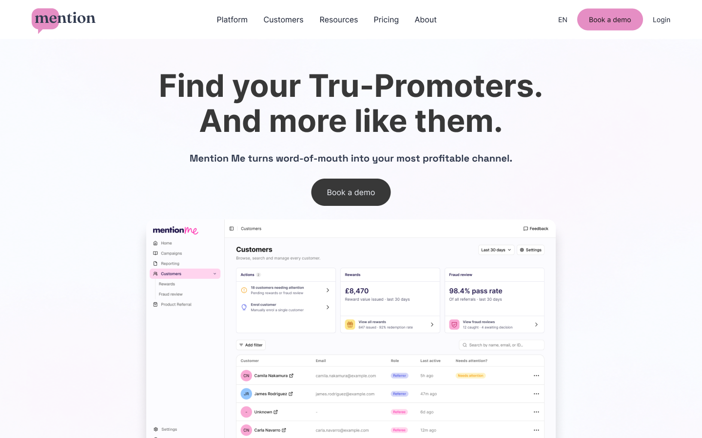
As Head of Product Design, I redesigned Mention Me’s referral platform to be self serve, rather than a white glove service.
CHALLENGE
To build a new design system and redesign the product so users can set up a referral campaign independently, as quickly as possible.
The product
Mention Me is a referral and customer data platform that helps brands turn word-of-mouth into a measurable acquisition channel, running incentivised and earned referral programmes with configurable campaigns, A/B testing, and data science signals.
Context
The new experience is a ground-up rebuild of Mention Me's product interface, replacing an ageing experience with a modern, faster one. Historically, the product was never built to be truly self-serve, so getting a referral programme set up and running leaned heavily on human support from customer success. I was tasked to change that: give the brands who use Mention Me a clearer, more capable way to set up and manage referral marketing campaigns themselves, so they can run, test, and monitor word-of-mouth acquisition without dated tooling or hand-holding.
Customers area
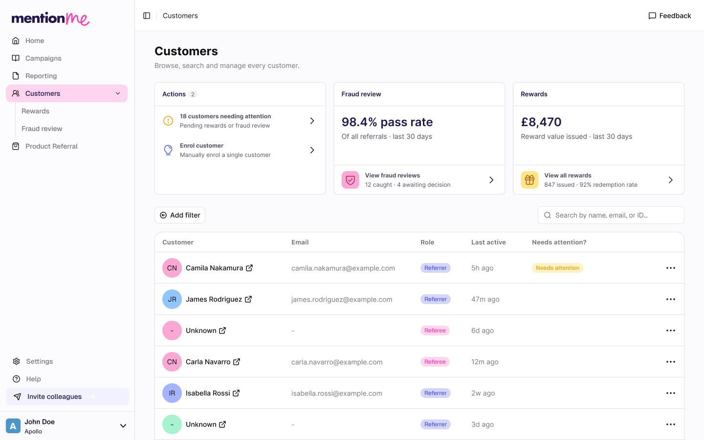
The new Customers area gives brands a clearer, more usable view of the people engaging with their referral programme. Filters sit above the table and the old tabs have been consolidated into filter chips, making it simpler to slice the data. Potential fraud is flagged with an at-a-glance signal count and explained on hover, rather than confronting users with a raw risk score, and the review workflow now makes approving or rejecting customers explicit, with clear states so brands can easily track and manage every decision.
Fraud review
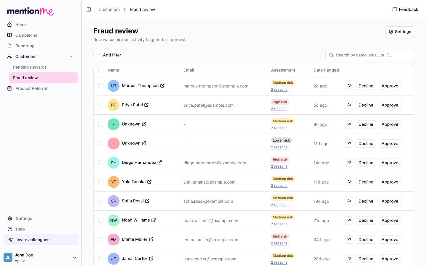
The new Fraud Review page helps brands spot and act on suspicious referral activity. Cases are grouped into low, medium, and high risk tiers, each with a suggested action, so it's clear where to focus. Fraud signals are presented digestibly rather than as a raw score, and an explicit approve/reject workflow lets brands review and track every case with confidence.
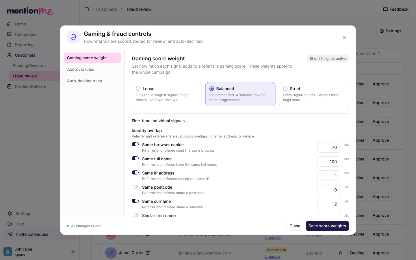
Merchants can customise how signals contribute to an overall score. To simplify what was previously a complex process, I introduced preset options (Loose, Balanced, Strict) for clients who don't need detailed customisation.
Reporting
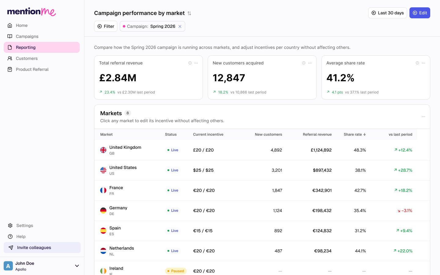
The redesigned reporting experience makes it easier for brands to find and build the reports they need. Instead of a dated, rigid setup, users can access existing reports and create new ones through a simpler flow, pulling the numbers that matter, on referral performance, acquisition, and campaign impact, without needing support.
Tru-Promoter report
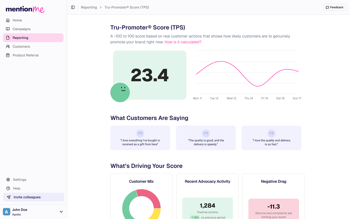
Tru-Promoter Score is a Mention Me metric that measures the strength of a brand's genuine advocacy (how many of its customers actively recommend it to others, and how much value that word-of-mouth generates). Rather than relying on stated intent like a traditional Net Promoter Score, it draws on real referral and sharing behaviour to show how effectively a brand turns customers into promoters, and benchmarks that performance against comparable companies so a brand can see at a glance whether its advocacy is strong or has room to grow.
Fast onboarding
Onboarding has historically been slow with clients averaging 80+ days to go live, with some stuck in setup for many months while work bounced back and forth between them and the Mention Me team. By stripping out steps and building a self-serve flow, we've already seen clients launch in as little as three days.
Promoter graph
Most businesses grow partly through word of mouth but that spread is usually difficult to track. The promoter graph makes it visible, mapping who introduced whom so a brand can see exactly how recommendations ripple out. It reveals the handful of people who bring in the most new customers, so businesses can focus on the customers who are worth far more than a single purchase.
An agentic interface
Our AI agent allows a merchant to simply describe what they want in plain language. Its standout ability is building a campaign from scratch in seconds: you tell it what you're trying to do (a refer-a-friend offer, for example) and it assembles the whole campaign on the canvas node by node.
Refreshing our branding
These website explorations start from a simple question: who are we, really? In a workshop we agreed the words we want people to feel; clear, calm, reliable, and friendly; crafted and characterful without ever being cheesy or robotic. Every design choice here is an attempt to make the pages look like those words, rather than picking a style first and justifying it afterwards.


How it’s going so far
Rebuilt the design system from the ground up with unified components, design tokens, and a fully branded dark mode.
Redesigned onboarding into a guided, step-by-step experience, reducing time to launch from 80+ days to as little as 3 days.
Reimagined campaign setup with an AI-powered assistant, enabling clients to launch campaigns in minutes instead of days.
Redesigned the reporting experience so insights are available in seconds, addressing one of the biggest sources of client frustration.