
INSITU
Reducing time-to-first-insight from hours to under 3 minutes
As Founding / Head of Design at Insitu, I redesigned the core reporting experience to help brands understand which ads drive performance.
CHALLENGE
Reduce time-to-insight by making it faster to create, find and revisit the reports that matter most.
Smarter Insights.
Better Creative.
Insitu helps brands understand which ads and creative actually drive performance across paid social (Meta and Tiktok). The team consisted of two founders, three engineers, a PM, and myself (Founding Designer).
Context
Insitu's MVP was showing early promise. Users who built reports kept coming back, and session times showed decent engagement. But retention wasn’t so good and too many users weren't making it far enough to see value.
Losing users before they reached their first insight was a commercial risk that I knew would make scaling the product harder.
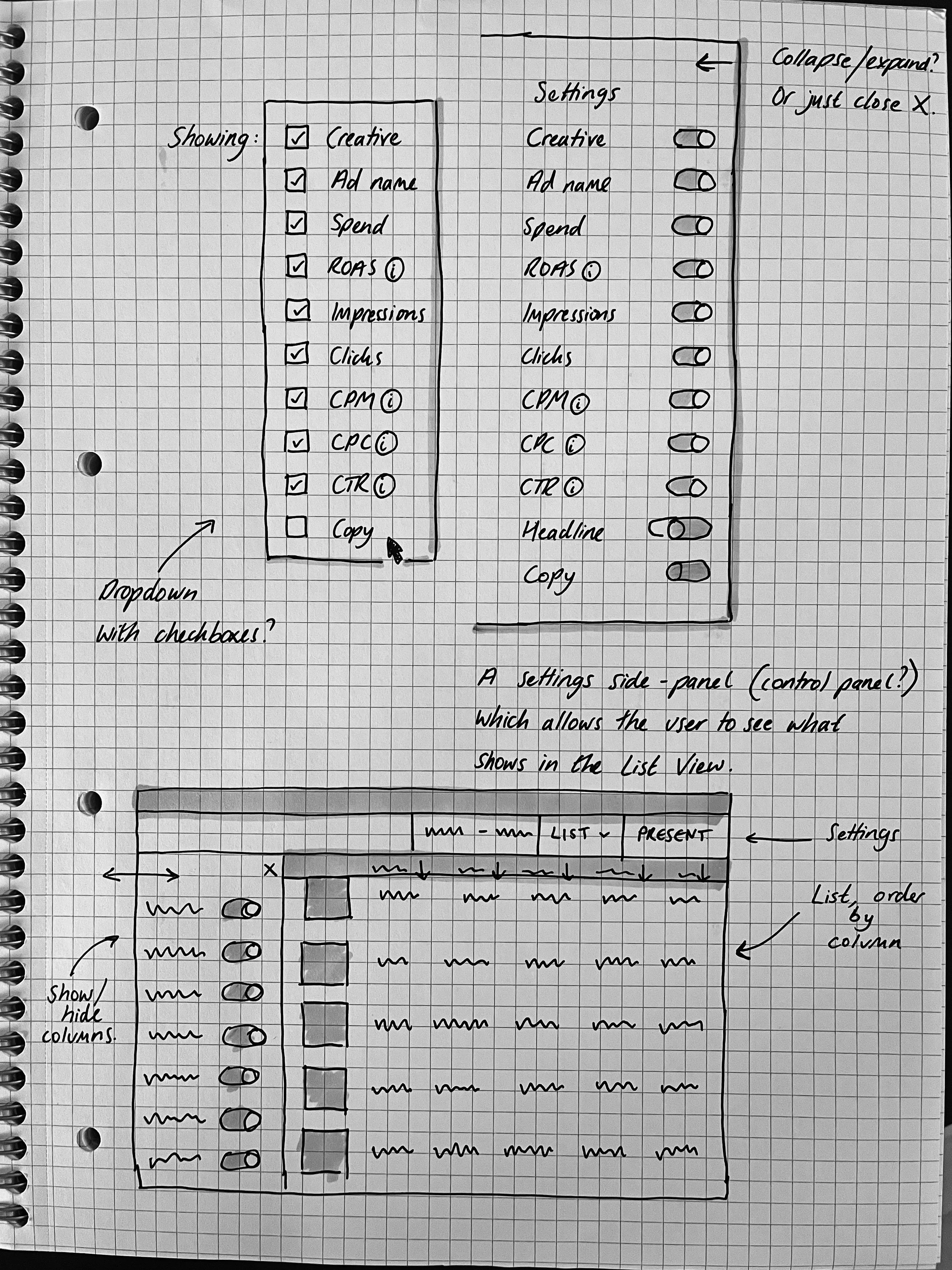
The problem
Our MVP proved valuable. 58% of our users, across 21 organisations, who built a report returned within a week, and average session times exceeded 45 minutes).
However, it was taking 2–3 hours for users to reach a first valuable insight, delaying activation and obscuring the product’s value.
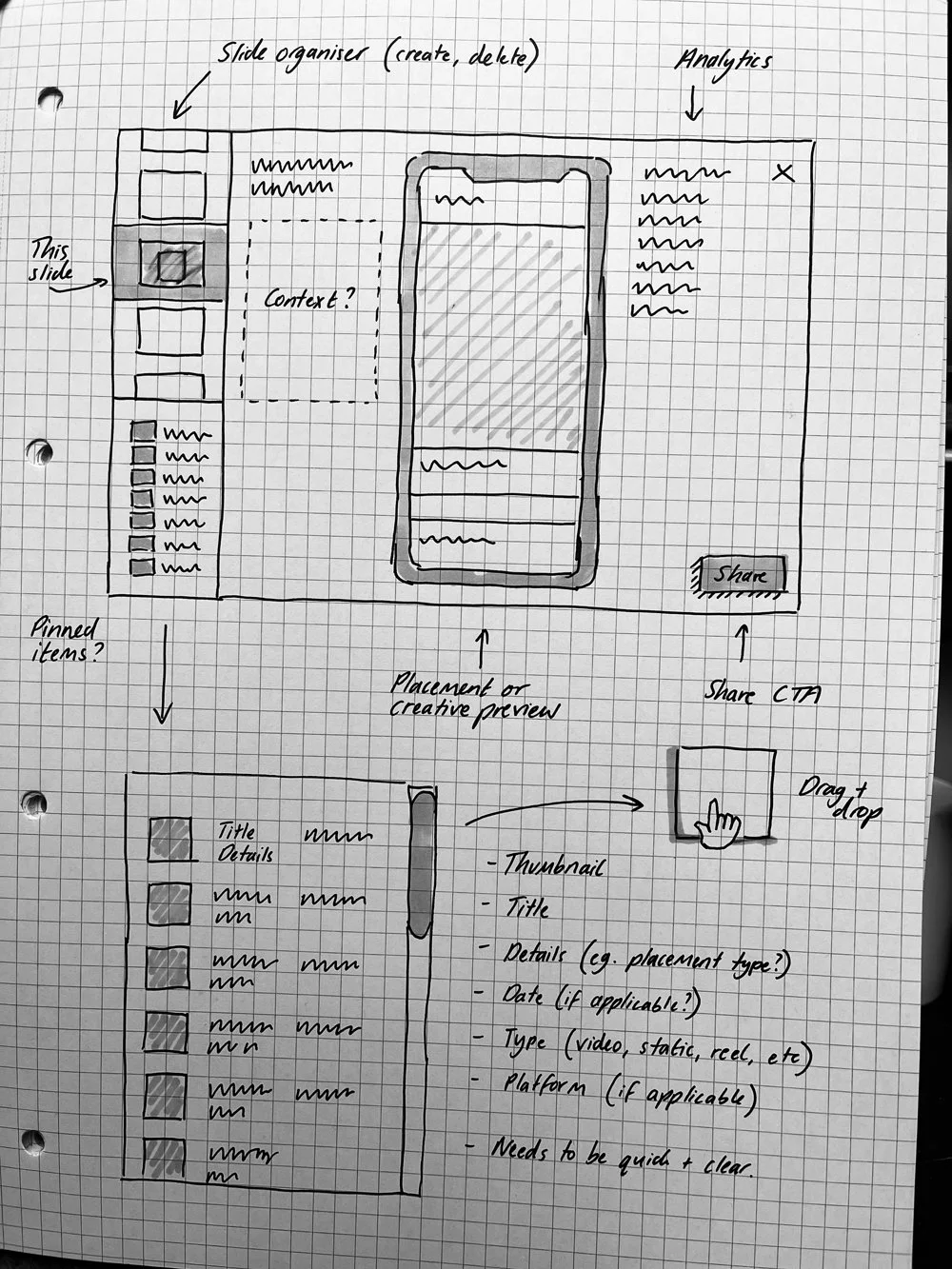
Considerations
Tight two-week deadline (including testing)
The solution should have the biggest impact for the least effort
Changes should be intuitive and self-serve, without requiring guided onboarding or user education
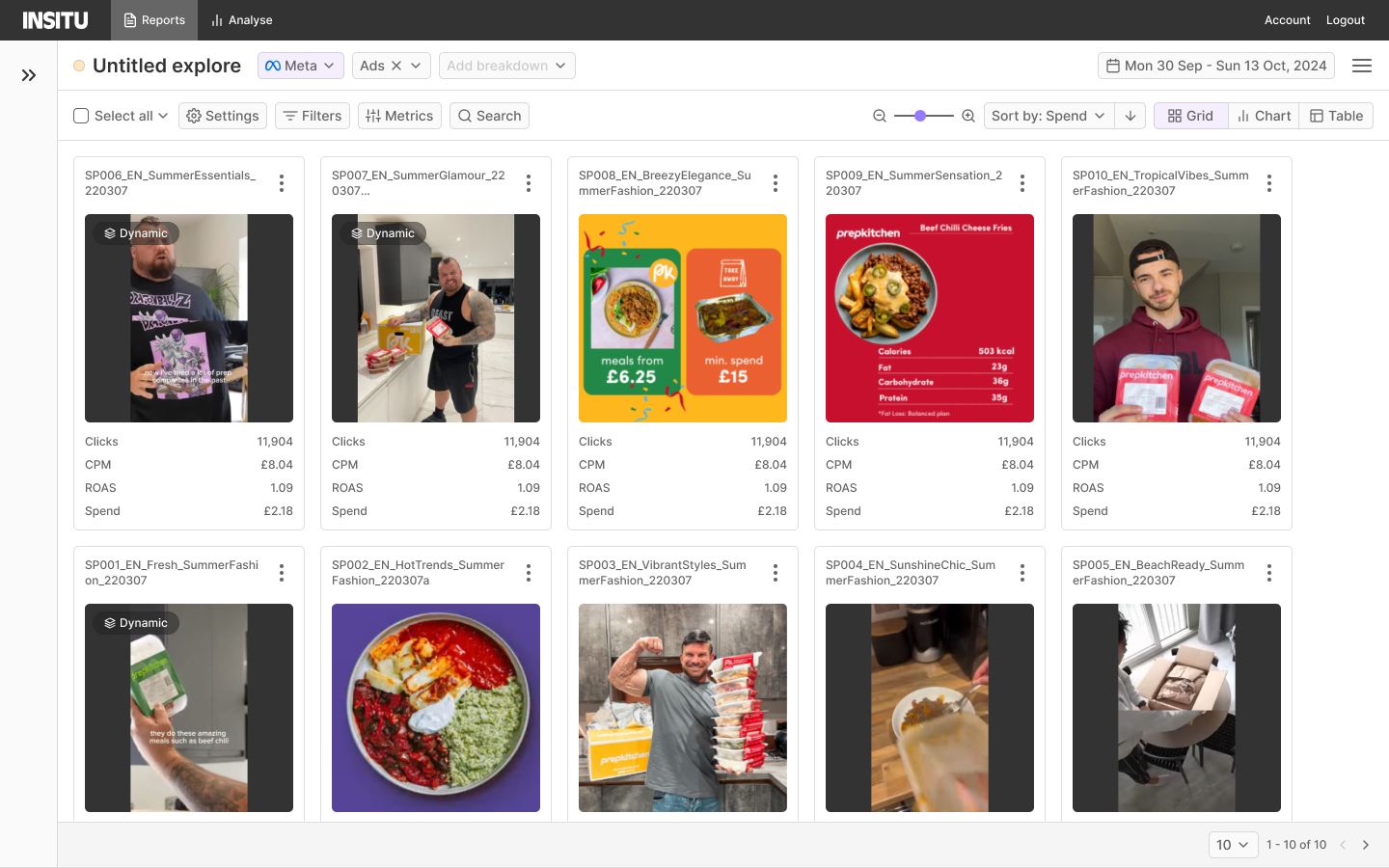
Reports vs Analyse
In our MVP the navigation at the top of the screen allowed users to switch between two types of reporting;
Reports let users browse and filter ads by time, performance, or attributes.
Analyse offered deeper, pivot-table-style breakdowns and more advanced functionality.
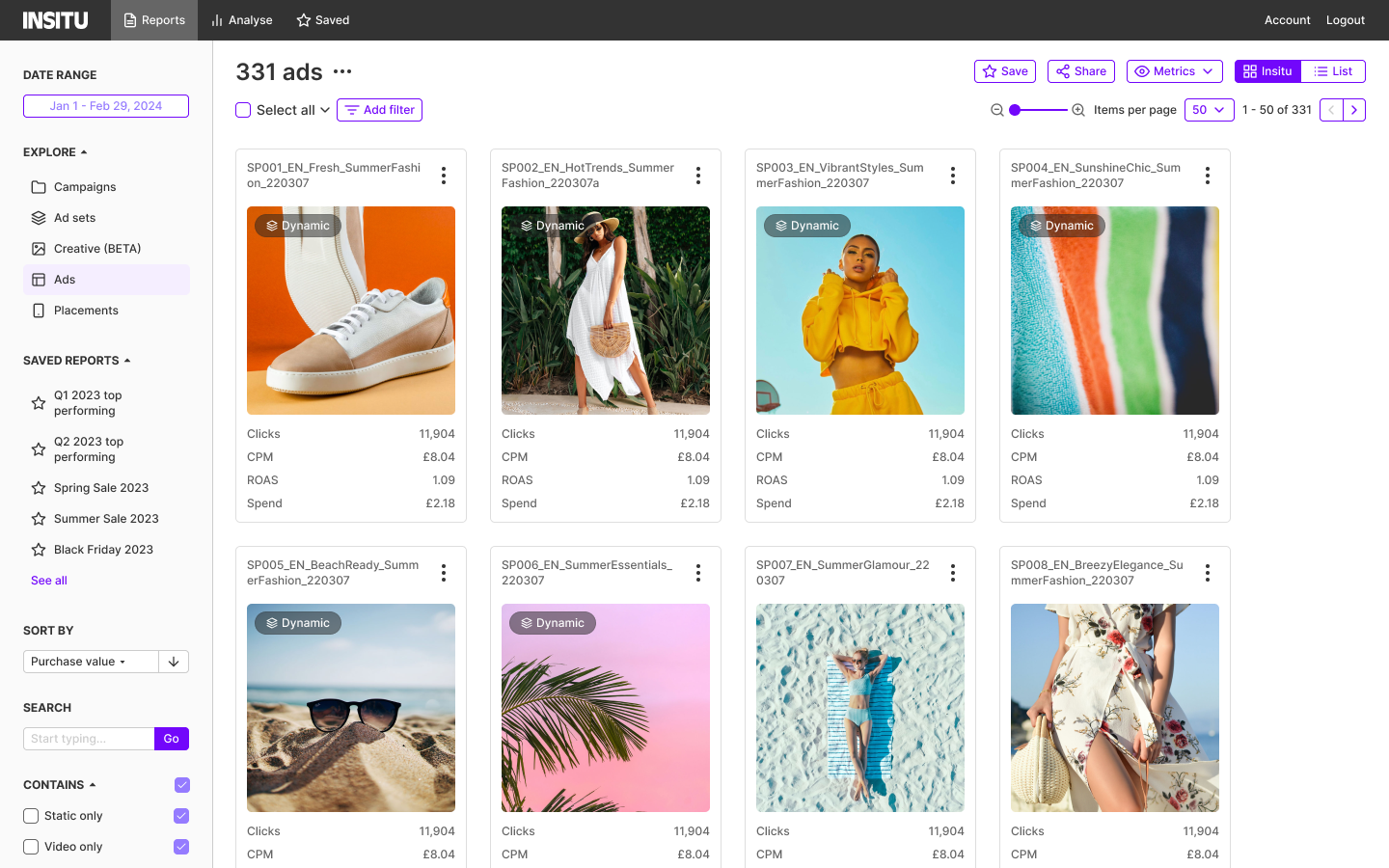
Side bar concept
I explored how we might allow users to manage their reports from the sidebar. Despite being tidy when collapsed, this area held so much core functionality it was effectively always open, reducing space for ads and undermining our visual-first experience. For this reason, I ruled it out.
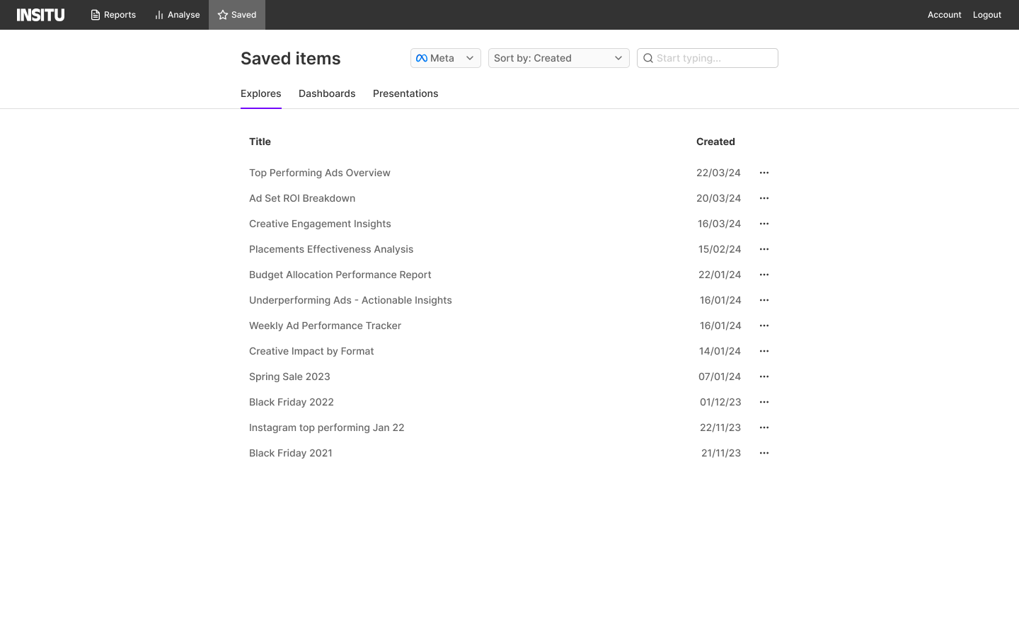
The ‘Saved’ tab
I explored adding a 'Saved' tab to the top-level navigation. However, navigating to it pulled users out of context and it became clear that users already struggled to distinguish between the Reports and Analyse sections. Adding a third tab would have made this problem worse.
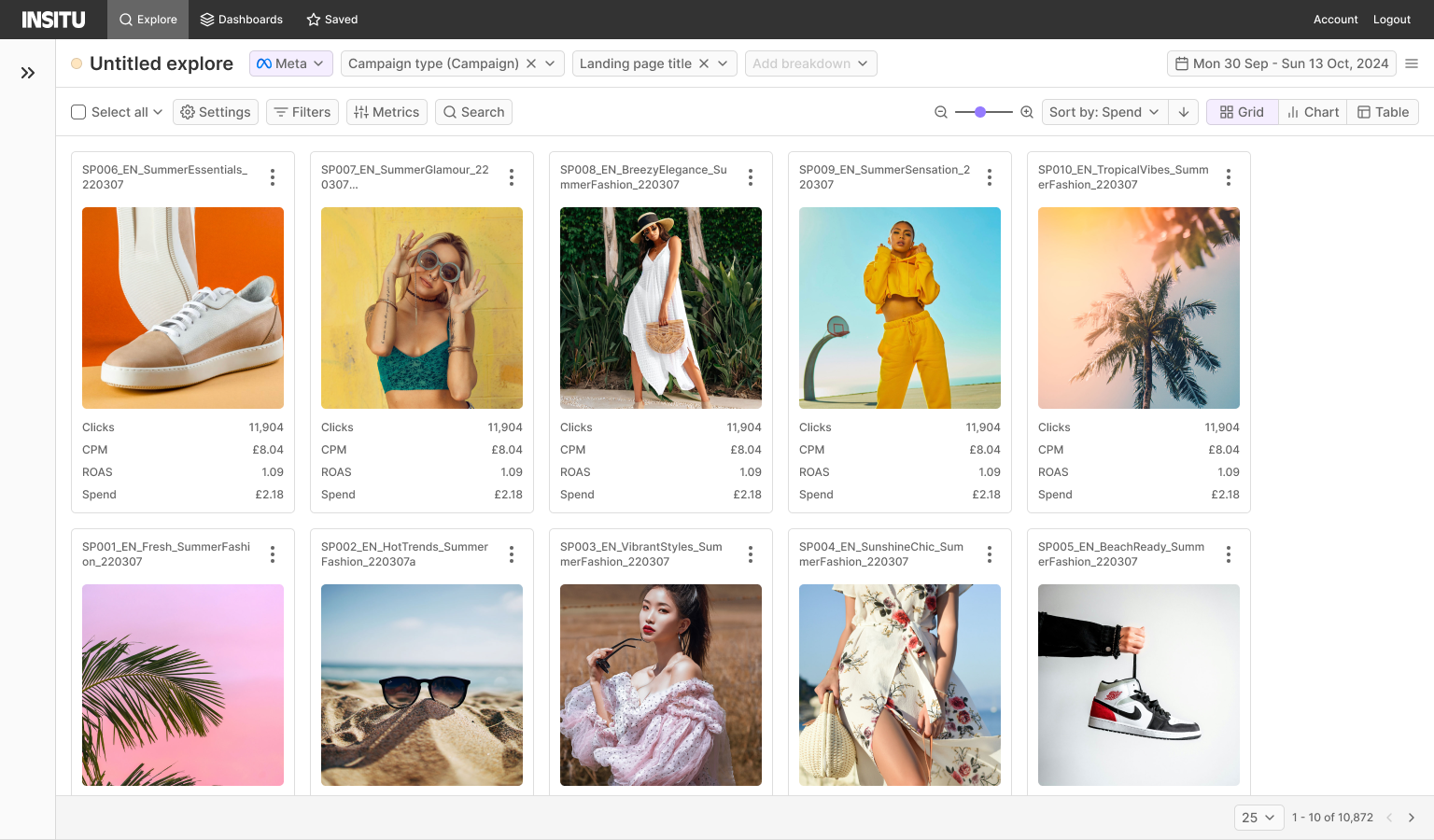
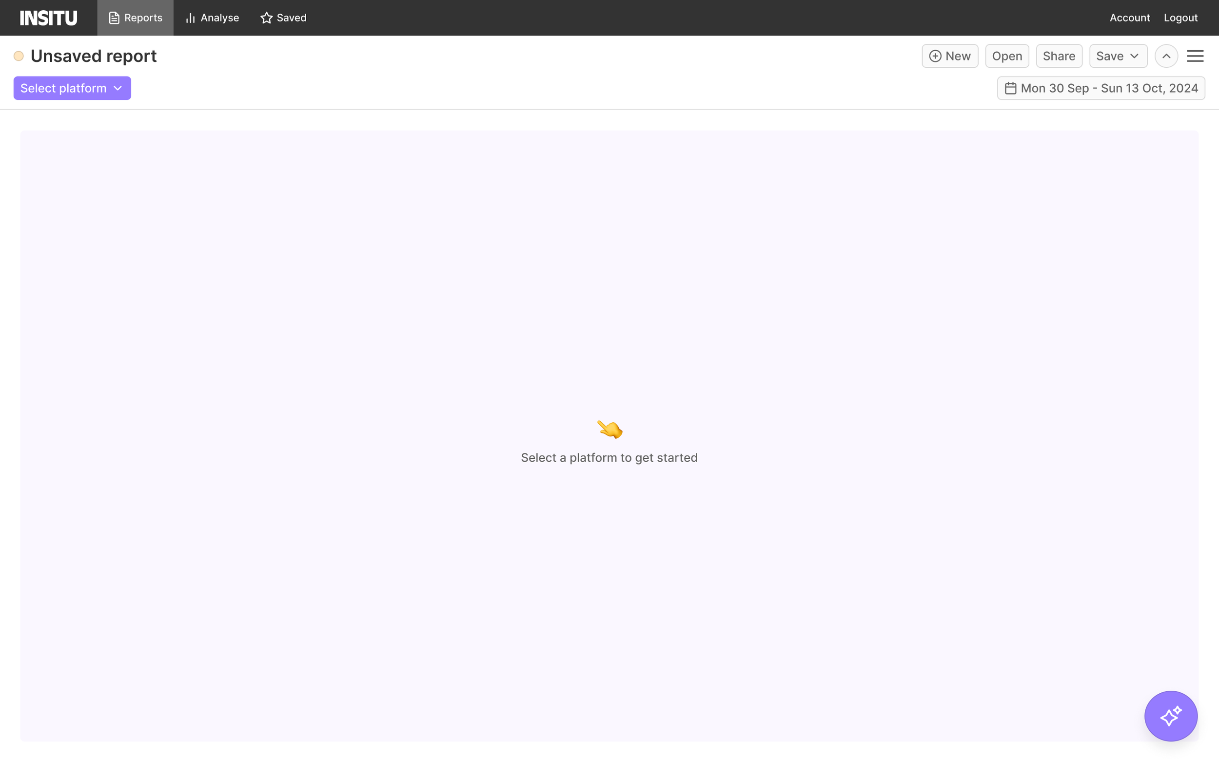
Default view
Our default view showed live Meta ads from the past two weeks, but users needed to build reports quickly rather than start from something that we’d assumed would be useful for all users. I instead added an empty report state that provided guidance.
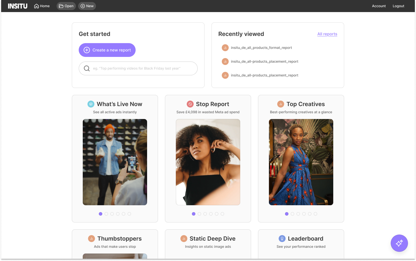
Template cards
Templates shown as visual cards on the Home screen, rather than a list or a dropdown.
Why:
Testing showed a small set of report types covered most use cases. Cards let order do the work: people read left to right and gravitate toward visuals they recognise, so putting the most useful templates first made them the obvious starting point.
Signal it was right:
Users who started from a template were 2x more likely to complete a report than those starting from an empty one.
Home concept
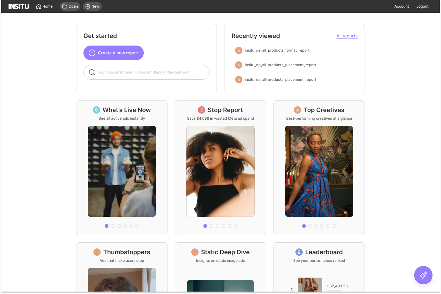
I designed a “Home” concept where users could land when they log in. It features a primary CTA to create a report and template reports surfaced in cards supported by visual
We ran usability sessions with 7 users from our design-partner group, watching for which report types they tried to recreate first and where they got stuck. 6 common report types emerged, which became our templates (see above).
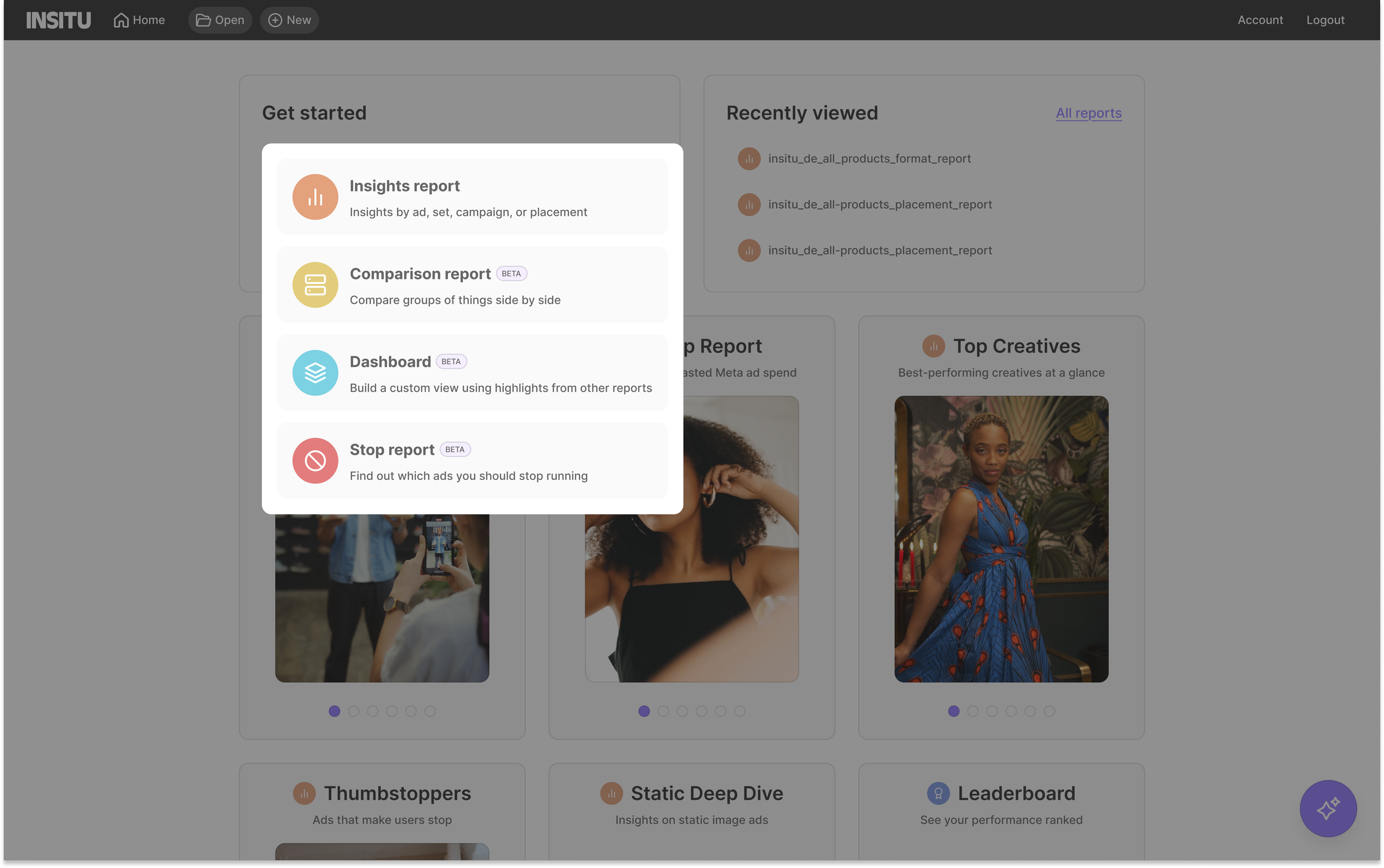
The primary CTA brings the key decision upfront, helping users choose a report type with clear explanations. It also employs progressive disclosure to avoid overwhelming them.
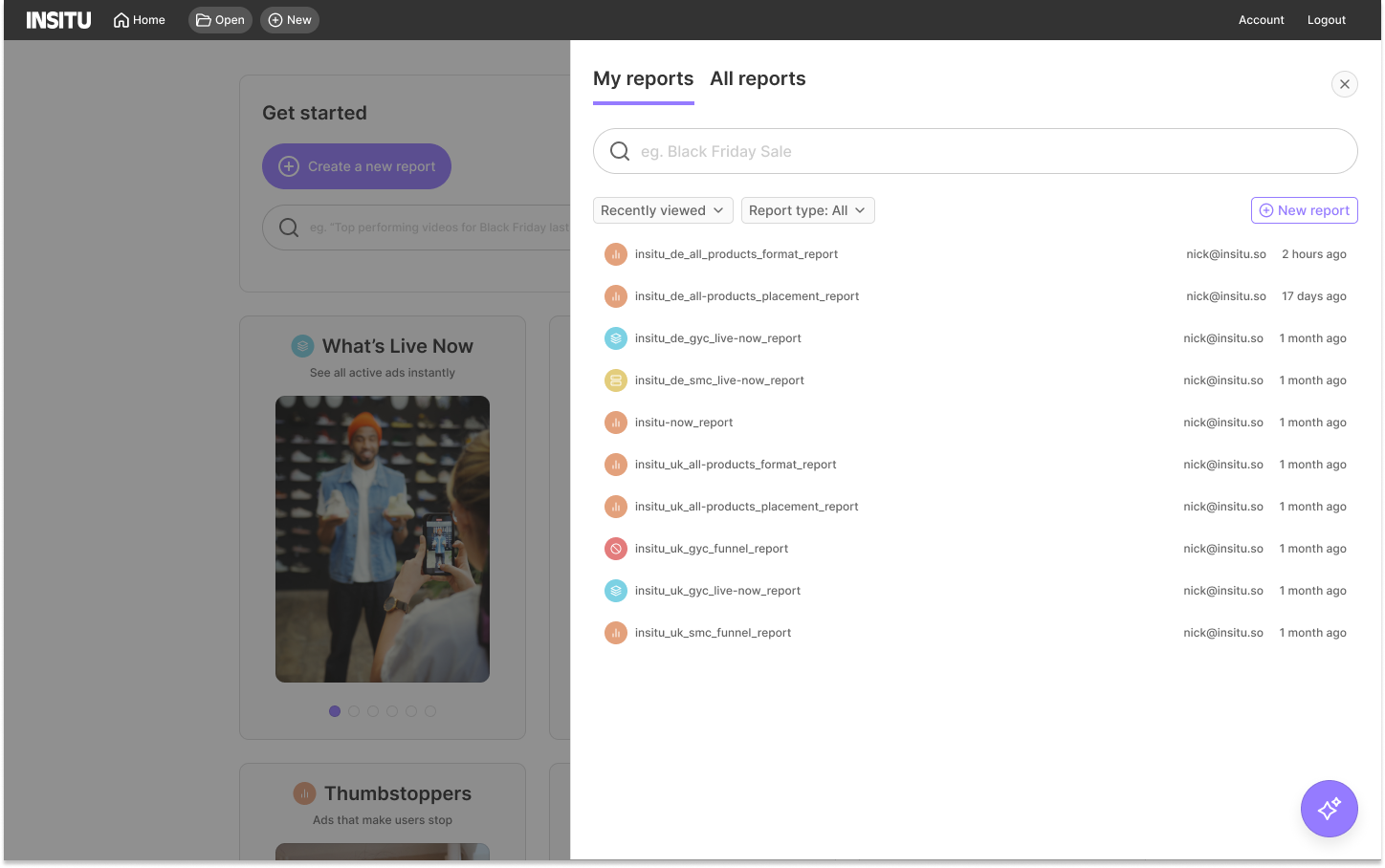
The ‘Open’ CTA in the top navigation provides quick access to existing reports from anywhere, balancing guided task initiation with fast access for returning users.
The decision
After exploring and ruling out the sidebar and saved tab concepts, the Home screen emerged as the clearest path forward. It was lightweight to build, which mattered given our two-week deadline, and it addressed the core problems in one place: a primary CTA that simplified report creation, template cards for the reports users were repeatedly building from scratch, quick access to recently edited reports, and a simplified top-level navigation.
It also gave the product room to grow, as the layout could accommodate new content without a structural rethink. Most importantly, every decision in the Home concept was in service of the same goal: getting users to their first insight as fast as possible.
Future proofing
I designed the Home area in a way which could allow for more content to be added in the future. This concept shows how we could add Creative Recommendations below our reporting templates.
An additional feature
A one-click "copy ad view" action and a persistent "Open" CTA in the top nav for jumping back into any report from anywhere.
Why:
Both came from repeated user requests, not a hypothesis. The job was making that repeated ask a one-click action, wherever someone was in the product.
Signal it was right:
It solved the same time-to-insight problem as the Home screen, but for returning users instead of new report builders.
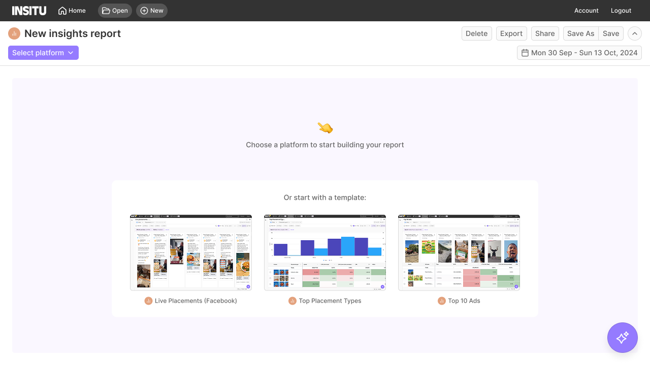
Introducing report templates created an opportunity to suggest commonly used templates at the moment a user creates a new report.
An agentic fallback
I collaborated with an engineer to rapidly prototype an AI-driven chatbot that allows users to generate reports using a simple text prompt, removing the need to manually navigate report setup. For example, a user could type: “Show my best-performing video ads based on ROAS in the last week on Meta.”
This was deprioritised due to complexity, but it was the next major feature we released.
Final designs
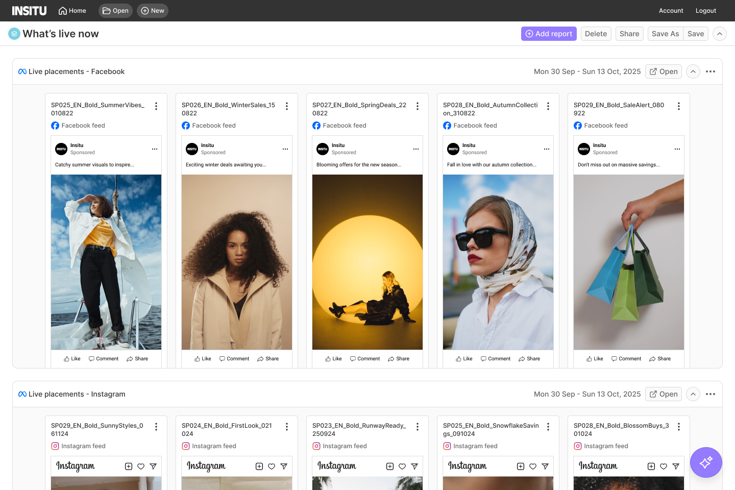
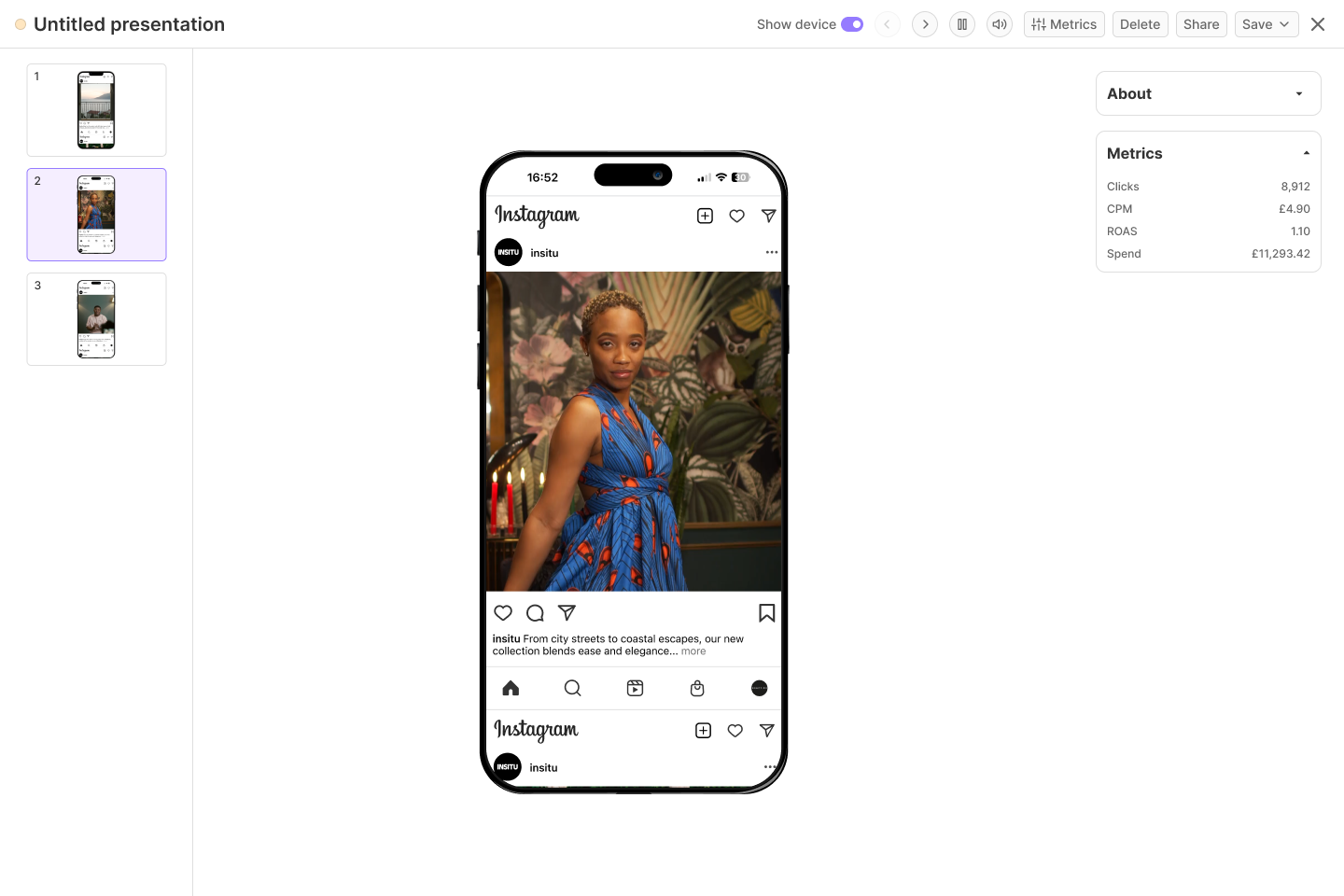
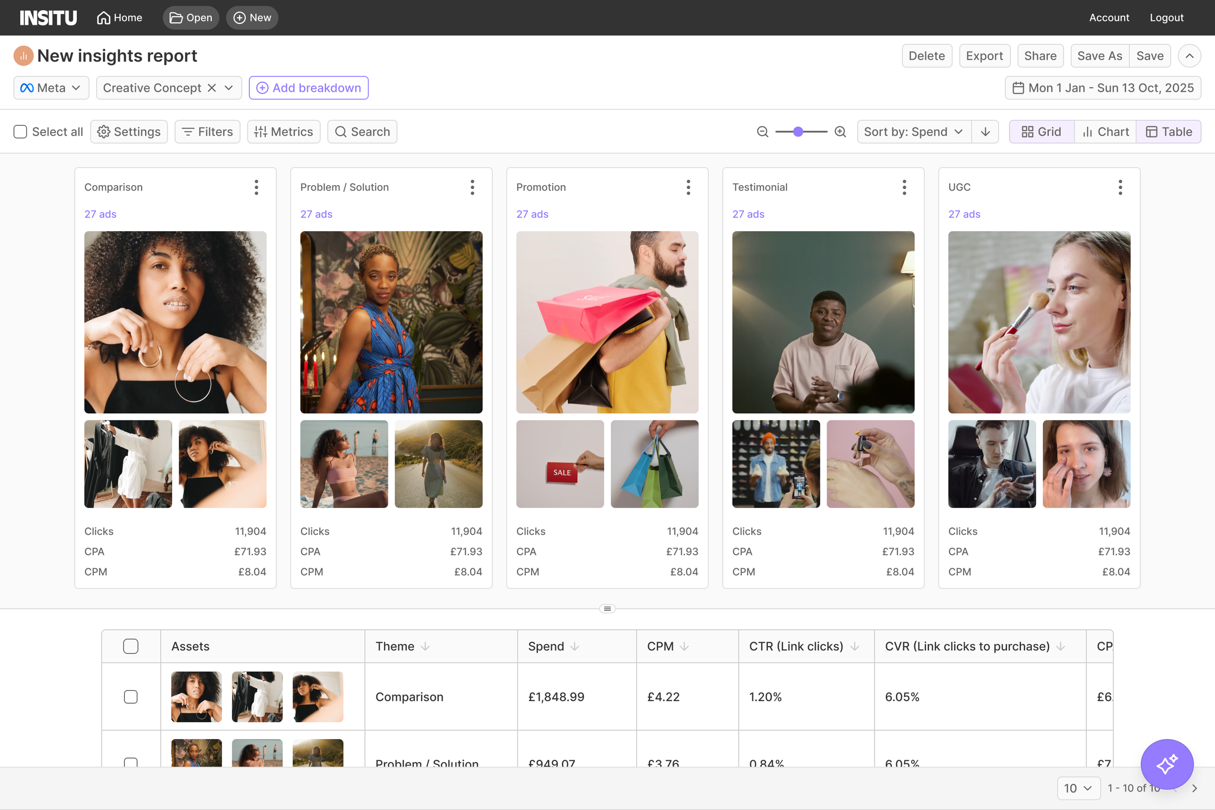
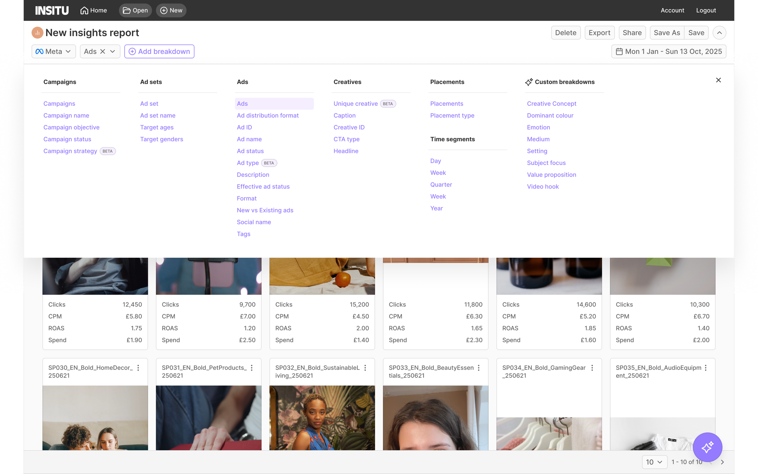
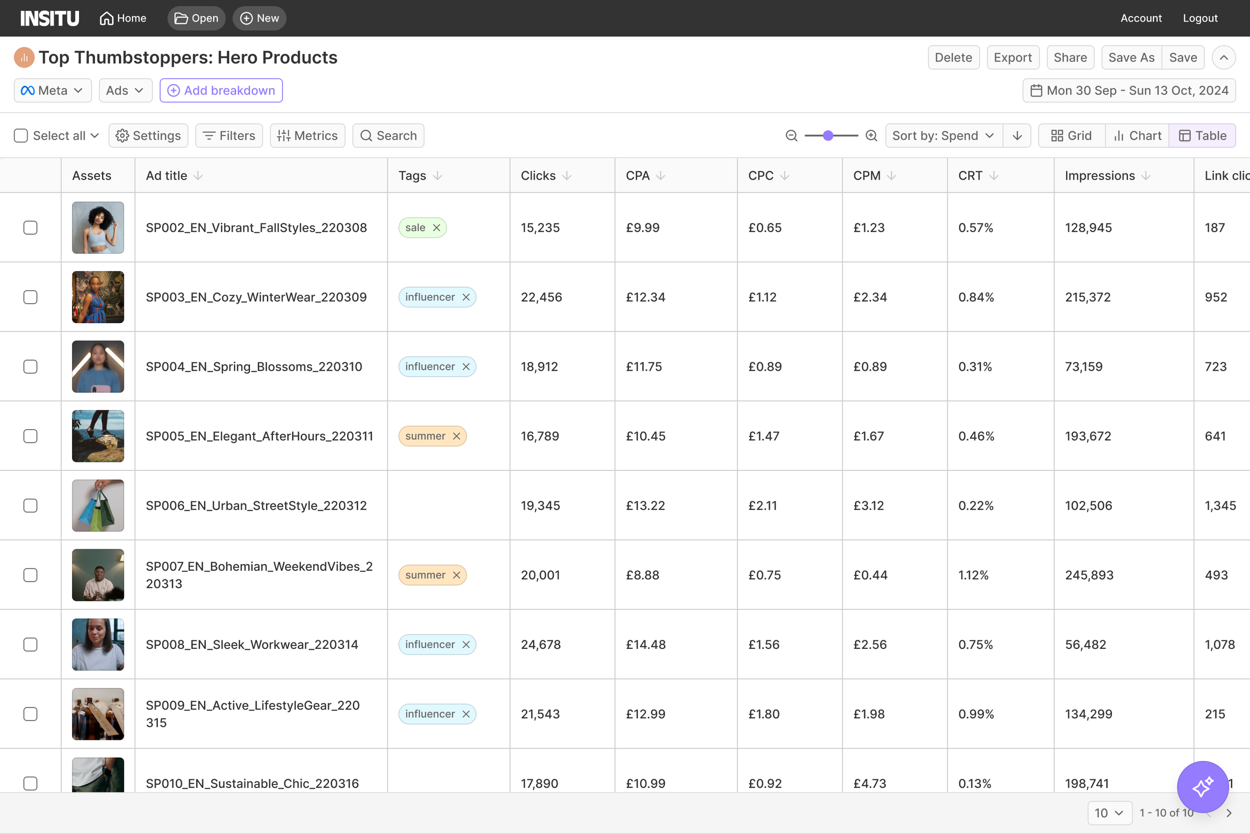
These are high-fidelity mockups I designed to represent the shipped solution, not production screenshots.
What I’d do differently
The navigation change seemed like a contained fix but it had knock-on effects that I'd consider more carefully with more runway. More importantly, the AI chatbot prototype I built in parallel with an engineer suggested a different answer to the same problem…
Users didn't want faster report-building, they wanted the platform to just tell them what mattered. Self-serve still delivered a 21% retention lift, but it's why I'd test a prompt-first approach first if I were tackling this again. It's also the direction the product went next.
Results
Rolled out to all 21 orgs on time
Reduced time to first insight from hours to under 3 minutes
Week-one retention improved from 58% to 79%. Improving week-one retention by 21% generated an estimated £181,440 in additional ARR annually, based on retaining 4.2 more customers per month.
0 organisations reverted to the “classic view”
We set out to reduce time to insight. We went from hours to under three minutes, and: